Engineering leadership
How to measure engineering team productivity

The short version.
- Throw out anything that can be inflated without the product improving: lines of code, commit counts, story points as a score.
- Measure the team's delivery system, not individuals. The unit of analysis is the whole decision.
- Use three families together — delivery (DORA), flow (cycle time, WIP), and review (pickup time, PR size, review quality).
- Read trends, not absolutes. A moving number is a question, not a verdict.
- Start with four metrics, not forty. You can add the rest once the first four have changed a decision.
Ask ten engineering leaders how they measure productivity and you will get ten answers, several of them wrong. Lines of code, commit counts, story points closed — the easy numbers are the ones that mislead most, because they measure motion rather than outcomes. This is a practical guide to measuring engineering team productivity in a way that survives contact with a smart, sceptical team.
Start by throwing out the vanity metrics
Lines of code rewards verbosity. Commit count rewards noise. Even velocity, genuinely useful as a planning aid, falls apart the moment it is treated as a productivity score — points inflate to hit the target and the number stops meaning anything.
The test worth applying: if a metric can be trivially inflated without the product getting better, it is not a productivity metric — it is a way to get lied to. Every vanity metric fails it. Our own commits per developer page carries no benchmark tier for exactly this reason: there is no honest "good" number for a commit count, and pretending otherwise would make the table worse than useless.
Measure the system, not the person
The single most important choice you will make is the unit of measurement. Productivity is a property of a team and its delivery system, not of an individual's output. The moment you rank people on these numbers you create an incentive to game them, and you poison the data you were trying to read.
This is not only an ethical argument, it is a statistical one. One person's numbers over one sprint are dominated by which tickets they happened to pick up. Aggregate to a team and that variance largely cancels. We make the full case in measuring developer productivity without surveillance, including what to do if you have a works council.
The three families that actually hold up
A balanced picture pulls from complementary families rather than any single score. Each family answers a question the others cannot.
Delivery: the four DORA keys
DORA covers speed and stability together, which is precisely what stops either from being gamed in isolation. Lead time for changes and deployment frequency describe throughput; change failure rate and time to restore describe stability. Optimise one pair while ignoring the other and the dashboard tells on you. The DORA dashboard shows all four against Elite, High, Medium and Low tiers.
One caveat that applies to every tool: deployment frequency and time to restore are estimates unless you have connected a real deployment or incident source. A tool that labels those as proxies is being honest; one that does not is quietly overstating its precision.
Flow: where work actually gets stuck
DORA tells you the outcome. Flow metrics tell you why. Throughput and cycle time read together separate "we shipped more" from "we shipped faster" — they are not the same thing and they often move in opposite directions. Work in progress is the most underrated metric on this list: more items in flight means each one waits longer, close to mechanically, so a rising WIP count is the earliest warning you get that cycle time is about to worsen.
Backlog age and issues opened versus closed cover the intake side. If you are opening more than you close week after week, no amount of prioritisation inside the backlog fixes it.
Review: the bottleneck nobody instruments
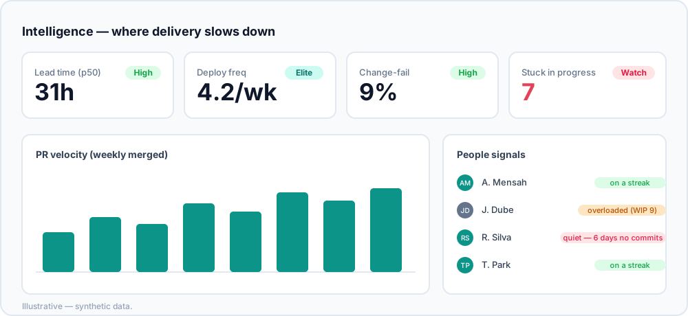
This is where most "we ship slowly" complaints actually resolve, and where most teams have no data at all. Review pickup time — how long a pull request waits before anyone looks at it — is frequently a larger share of lead time than the work itself. PR size distribution is usually its cause: large pull requests do not get reviewed in a spare half hour, so they sit.
Review quality is the guardrail. Speed here is easy to fake — approval coverage stays high while comment rate collapses and instant-merge rate climbs, which is what rubber-stamping looks like in data. And reviewer participation tells you whether review load sits on two people, which is a delivery risk as much as a fairness one.
A note on SPACE, and on AI
SPACE is worth knowing as a corrective rather than an instrumentation plan: it argues productivity spans satisfaction, performance, activity, communication and efficiency, and that sampling across dimensions beats optimising one. In practice DORA and flow give you numbers to instrument this quarter, and SPACE reminds you what those numbers are not capturing — mostly how the work feels, which only asking people will tell you.
If AI tooling spend is the reason you are measuring at all, AI adoption belongs alongside the delivery metrics, and the method matters more than the metric — see how to prove your GitHub Copilot ROI.
A starting set you can defend
You do not need all of it on day one, and trying to adopt forty metrics at once is the most common way these programmes die. A defensible starter kit is four numbers:
| Metric | Question it answers | Act when |
|---|---|---|
| Cycle time | How long does work take end to end? | The trend rises for three or more weeks |
| Review pickup time | How long does work wait for attention? | It exceeds one working day consistently |
| Work in progress | Are we starting faster than we finish? | The sparkline climbs while throughput is flat |
| Change failure rate | Is the speed costing us quality? | It rises while any speed metric improves |
Read them together, look at trends rather than absolute values, and treat a moving number as a question — "review wait doubled this sprint, what changed?" — not a verdict. Keep the calculations visible and inspectable so the team trusts them, because the first serious dispute about a number decides whether the whole programme survives.
Turn measurement into improvement
Metrics only pay off when they change a decision. The loop that works is deliberately small:
- Baseline. Capture a full quarter before changing anything.
- Change one thing. One deliberate change to how the team works — a PR size norm, a review rota, a WIP limit. One, so the result is attributable.
- Wait a quarter. Shorter windows measure holidays and releases, not your change.
- Compare equivalent windows. The period comparison view does this across six KPIs and grades each Improved, Regressed or Flat.
- Write down the result either way. A change that did nothing is worth knowing, and it is the finding people most often quietly drop.
If cycle time dropped and quality held, you have evidence. If nothing moved, you learned that cheaply. What you cannot measure before and after, you cannot prove — and unprovable improvements have a way of quietly reversing.
The failure modes to watch for
- A metric in a performance review. The fastest way to destroy the data. If a number could appear in a review, do not collect it per person.
- Targets instead of trends. "Get cycle time under three days" produces smaller tickets, not faster delivery.
- Dashboards nobody opens. If no decision changed in a quarter, the programme is decorative — cut it to four metrics and try again.
- Comparing teams that do different work. Platform and product teams have legitimately different numbers. Compare each to its own history.
- Unexplained definitions. The first time someone disputes a number and nobody can explain it, the tool loses permanently.
Frequently asked
- How do you measure engineering team productivity?
- Measure the delivery system rather than individual output, using several complementary metric families rather than one score: DORA for delivery health, flow metrics for where work gets stuck, and review metrics for collaboration bottlenecks. Read trends rather than absolute values, and treat a moving number as a question to investigate rather than a verdict.
- What is the best single metric for developer productivity?
- There is not one, and any tool selling you one is selling you something gameable. Productivity is a trade-off between speed and stability, so any single number can be improved by sacrificing the thing it does not measure. The smallest honest set is cycle time, change failure rate and review pickup time read together.
- Why are lines of code and commit counts bad metrics?
- Because they can be inflated without the product improving. Lines of code rewards verbosity, commit count rewards noise, and story points inflate to hit whatever target is attached to them. A useful test: if a metric can be trivially gamed without users being better off, it is not a productivity metric, it is a way to get lied to.
- What is the difference between DORA and SPACE?
- DORA is four specific delivery outcome metrics — deployment frequency, lead time for changes, change failure rate and time to restore. SPACE is a broader framework arguing that productivity has five dimensions including satisfaction and collaboration, and that you should sample across them rather than optimise one. In practice DORA gives you numbers to instrument today; SPACE reminds you what those numbers are not capturing.
- How long before engineering metrics are meaningful?
- Expect a quarter before a trend is trustworthy. Weekly figures are dominated by holidays, releases, absences and incidents, which is why almost every widget worth reading is presented as a trend rather than a current value. Baseline first, change one thing deliberately, then compare equivalent windows.
Deckgauge puts these metrics in one open-source, self-hosted board so the whole picture is in front of you, with a documentation page per widget explaining what it measures and how it can mislead you. Deploy it free, or have a fractional CTO read your numbers with you via an Engineering Health Check.